CaesarZX:
对于RTS游戏《横扫千军》的制作,Geoffrey Keighley的文章已经不足以全面讲述那段历史,而加入一个亲自参与此游戏制作的人物的视角,我们就可以看到一个更完整的横扫千军诞生史。 这篇连载作者是《横扫千军》美工总监Clayton Kauzlaric,他从去年9月开始在他自己的Blog上连载自己在Cavedog参与制作《横扫千军》 的经历。本连载由我的blog与游戏编年史的主人无声畅游合作翻译推出。
第三章:“纳米潮”的中期(?)
CaesarZX 译
一个临时的标题背景——1996年秋季
《横扫千军》制作速度很快。简直是飞快。那庞大的源代码和内容只用了不到一年就完成了。我把这归功于两个原因:疯狂的超时工作和良好的前期制作阶段。
即使在今天,前期制作总是一个很容易被游戏发行商和制作者忽略和低估的环节。花点时间去找到合适的工具和技术并花时间观察一下,来让一个游戏听起来很像一回事,可这些偏偏被轻易得忽视掉了。虽然期间你并不会一直有在制作个什么东西的感觉,而且有时候非常难说清你究竟在制作什么(特别是对一个紧张的主管来说。),可是前期制作恰恰是极其有用的。这能让一份充实的制作任务安排布置得恰到好处,还可以让核心队伍更轻松地分享Kool Aid(CaesarZX这里有点不解,Kool Aid是种应料品牌,是否说明核心人员可以在一边歇着而让新手干?)并迅速地训练新加入的组员。我笃信每一周的前期制作都能节省至少三周的正常开发时间。是真的,我都有记录的。
到1996年秋天,我们开始为全面启动制作而加快速度,并急忙招收新人。到那之前发生了很多事:比如我们找到了一个故事的借口,我们还有了一些勉强能用的工具,但开始对游戏有了信心。(CaesarZX:此处问题不小。)
我们还有了个新的发行商。GT Interactive在1996年7月收购了Humongous Entertainment。这是Chirs和我从没意料到的。要是说我们当时大吃一惊,已经是很委婉的说法了。《横扫千军》当初纯粹是(由妈妈爸爸的赞助的,)自力更生(bootstrap operation直译是“可以自行运作的”),而现在却属于一群在纽约的家伙了。尽管这类事情在商界屡见不鲜,但依然造成了一些紧张甚至是恐慌。
GT(原先是Good Times“好时光”的缩写,……)竟和我们一样吃惊。当收购了Putt Putt,Freddi Fish和Fatty Bear(都是Humongous Entertainment的游戏里的角色,针对儿童玩家。)的制作者后,他们才有那么一丝感觉到有个即时战略游戏正隐藏在这栋楼里的某处。这样看上去很般配。GT由于发行了Doom《毁灭战士》,Quake《雷神之锤》和《毁灭公爵》而攀升到第三大游戏发行商的位子。而《横扫千军》看上去会与他们的地位十分相称。这游戏肯定会得到比在被收购之前好得多的发行待遇。更强的后盾也提供了保证能让《横扫》完成的资金。我们为GT Interactive的头儿们制作了一个快速演示,他们看上去很喜欢。所以,放手全速前进的时刻到了。
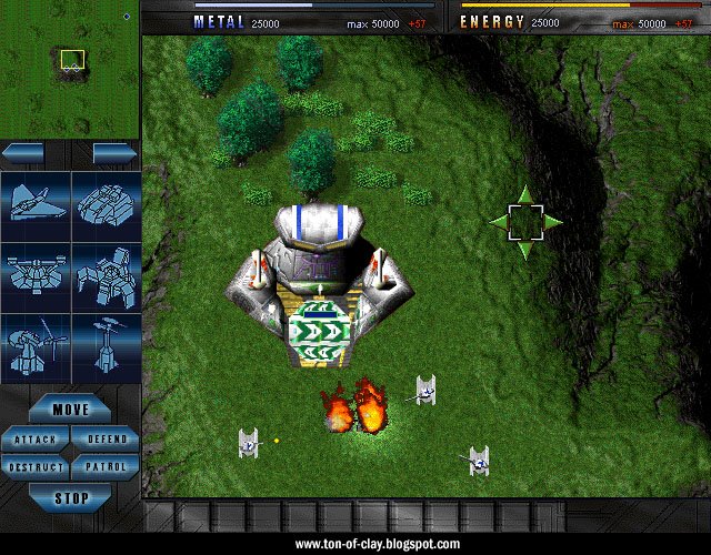
这些截图是当一些不同的界面设计被同时考虑的时候虚构的(虽然地图画面和单位是正式的)。这就是为什么图中建造菜单里的建筑物和车辆都混在一起。
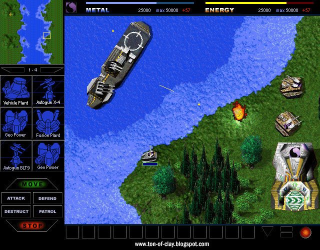
这些是1997年1月和2月,或者说是制作大约进行到中期时的截图。一个月之后我们就开始为广告制作正式截图了,实现我们的新闻宣传预览零的突破。
这还是相当粗糙的,但是比起几个月前的已经有所不同了。任何玩过这个游戏的玩家们会感觉许多单位似曾相识,尽管比之前看到的有了很多变化。我们可以来一个“猜猜是什么单位”的竞赛。我们稍稍考虑了一下多人游戏派别的一组标识(包括一些疑似实验试管的),在这里可以看到其中几个。要看到单位上的标识实在很费眼力,所以我们还是用了最基本的Arm/Core徽章。当时的引擎仅仅支持640X480的分辨率,这就是为什么截图里的控制面板看起来巨大无比而那些单位大得简直快爬到你鼻子底下来了。试试在Kbot工厂找到很酷的“阴阳八卦图”吧。
这些建造按钮有很短一段时间用的是蓝图,我当时觉得这个能行。我们有所有单位的3D模型,所以这类简单的线框图看上去是很好的建造开端。
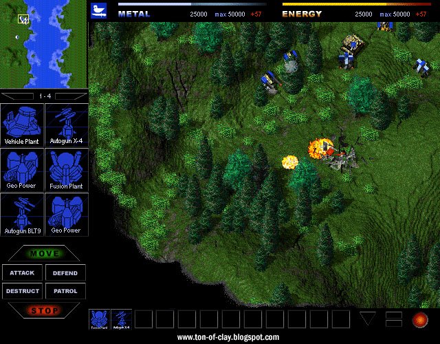
可那却给我们带来了一个问题。有人会对那些细细条条的多边形线框构成单位感到头疼。要区分它们都是个难题,更不用说让它们漂亮了。虽然所有人都能一眼就分辨出坦克和飞机,可却无法区分K-bot工厂和金属储藏罐。而软件渲染师也帮不了什么。材质时常会发生严重的偏移和“飘逸”。早期的引擎总是随着当日的气压(作者的玩笑)使多边形从实体上飘进飘出。我们当时真的担心我们的小机器人和小发明们如何才能齐心协力与其他那么多游戏中精美的预渲染(伪3D)单位抗衡。我们知道一旦有人看到我们的游戏中的单位移动,我们会就有优势。可我们始终不能满意静态截图中单位的样子。
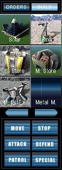 这接近了建造按钮的最终样式。Ron Gilbert建议我们用带有“魅力无穷的3D截图”的小按钮来更具视觉化地表现这些单位。左图是横扫千军建造菜单的早期版本。
这个“单位问题”也引发了我们的动画截图的创意,我们使用的多种新奇方式的第一种就是用新兴的因特网这东西去吸引和建立玩家群。(CaesarZX翻译问题:最后这一段翻译问题不小)
待续
[indent]
Part 3: Mid Nano-Stream
Total Annihilation came together fast. Really fast. The bulk of the game’s code and content was created in less than a year. I credit this to two things: insane work hours and a good preproduction phase.
Preproduction is frequently overlooked and underestimated by publishers and game developers, even today. Taking the time to figure out tools, techniques and a look for a game sounds like good sense, but it is often written off as indulgent fluff. It doesn’t always feel like you’re producing something, and it’s sometimes hard to show that you are (especially to a stressed out executive) but preproduction is incredibly useful. It gets a solid production pipeline in place, and makes it easier for a small core team to share the Kool Aid and quickly indoctrinate new recruits. I firmly believe that every week of preproduction saves at least three weeks of regular development time. It’s true. I have notes.
By the Fall of 1996 we were gearing up for full production and adding staff in a hurry. A lot had happened by then. We had figured out our excuse for a story. We had marginally functional tools. We started getting a good feeling about the game.
We also had a new publisher. GT Interactive bought Humongous Entertainment in July of 1996. Chris and I had no clue that was going to happen. Saying we were surprised is putting it mildly. Total Annihilation was started under the auspices of a mom n’ pop, bootstrap operation and now it belonged to some guys in New York. Stuff like that happens in business, but there were some moments of stress and consternation.
GT (originally initials for “Good Times”) was as surprised as we were. When they bought the makers of Putt Putt, Freddi Fish and Fatty Bear, they were only marginally aware that an RTS game was lurking someWhere in the building. It seemed like a good match. GT had risen to be the third biggest game publisher by distributing Doom, Quake and Duke Nukem. Total Annihilation looked like it might be a good fit for them. The game would certainly get better distribution than it would have before the acquisition. Funding for TA’s completion would also be on more solid ground. We did a quick demo for some GT Interactive execs about a month later and they seemed to like what they saw. So, it was full steam ahead.
These screens are mockups From a time when different interface designs were being considered (though the maps and units are all legit). That’s why there are structures and vehicles all mixed up on the same menu.
These are From January and February of 1997, or roughly the mid-way point of the production phase. This is just a month before we started making screenshots for our first print ad and our nearly nonexistent preview coverage.
It’s still rough, but quite a difference From just a few months earlier. Many units will be familiar to anyone who has played the game, though some saw major changes in the months ahead. Let’s have a fun “guess that unit” contest. We were briefly considering a whole heap of team symbols (including some suspiciously like lab glassware) for multiplayer, several of which can be seen here. Those were too hard to see on most units, so we just went with the basic Arm/Core insignias. The engine only supported 640 x 480 resolution at this point, which is why the UI looks gigantic and the units seem ready to crawl up your nose. Dig the groovy yin-yang on the Core Kbot lab.
The build buttons are From a brief phase Where I thought a blueprint sort of look might work. We had all those 3D models, so a simple shot of the wireframe seemed like a good place to start.
That brings up an issue we had. There were continual headaches with those itty bitty polygonal units. It was always a challenge to make them distinctive and engaging. Everybody knows what an airplane or tank looks like at a glance, but the same wasn’t true for a damn K-bot lab, much less a metal storage facility. The software renderer wasn’t helping much either. Textures tended to shift and “swim” a lot. Early incarnations of the engine often had polygons popping in and out of existence depending on the barometric pressure that day. We were genuinely concerned about how our little robots and gizmos would stack up against the crisp prerendered sprites found in so many other games. We knew our game would have an edge once people saw the units in motion, but we were never happy with how the units looked in static screen shots.
This lead to the final version of the build buttons. Ron Gilbert suggested we go with small “glamor shots” to help sell the units visually. At left is an early version of a build menu for Total Annihilation.
The “unit problem” also lead to the creation of our animated screenshots, the first of several novel ways we used that newfangled Internet thing to find and build an audience for the game.
[/indent]